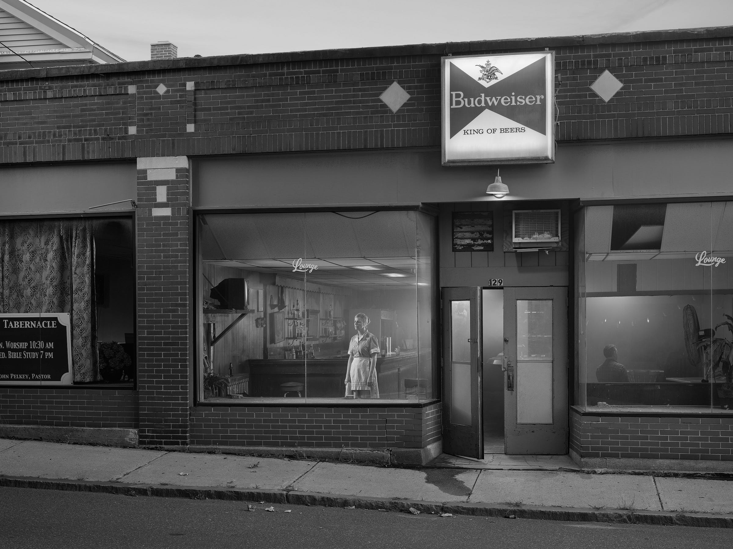
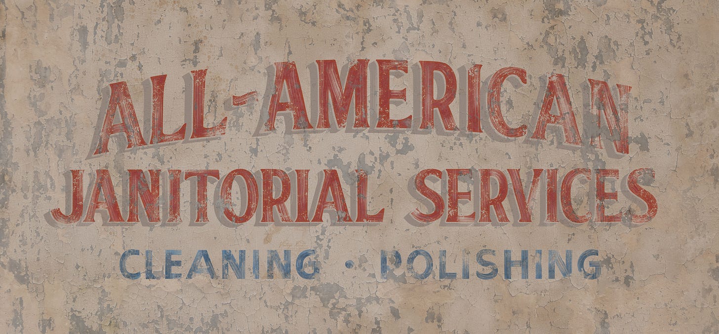
WHEN I WAS FIRST THINKING about Eveningside, I knew signs, uniforms, logos, work vehicles, and lettering on windows and would be prominent elements. I turned to Perry Grebin, whom I’d started working with on An Eclipse of Moths in 2018. He is a genius of fonts, aged lettering, sign materials, and wording. He thinks about signs much like a storyteller: When were they first made and what was the context? What did the sign say then and what does it tell us now? Most people probably — hopefully — look at the pictures and don’t even notice the signs. That means we’ve succeeded and they look like they’ve been there forever.
Perry, Juliane and I sat down recently and looked through the Eveningside pictures and reminisced about many of the signs he designed for this series, along with the vintage Massachusetts license plates. Below are excerpts from that conversation, and, where in italics, comments supplied by Perry.
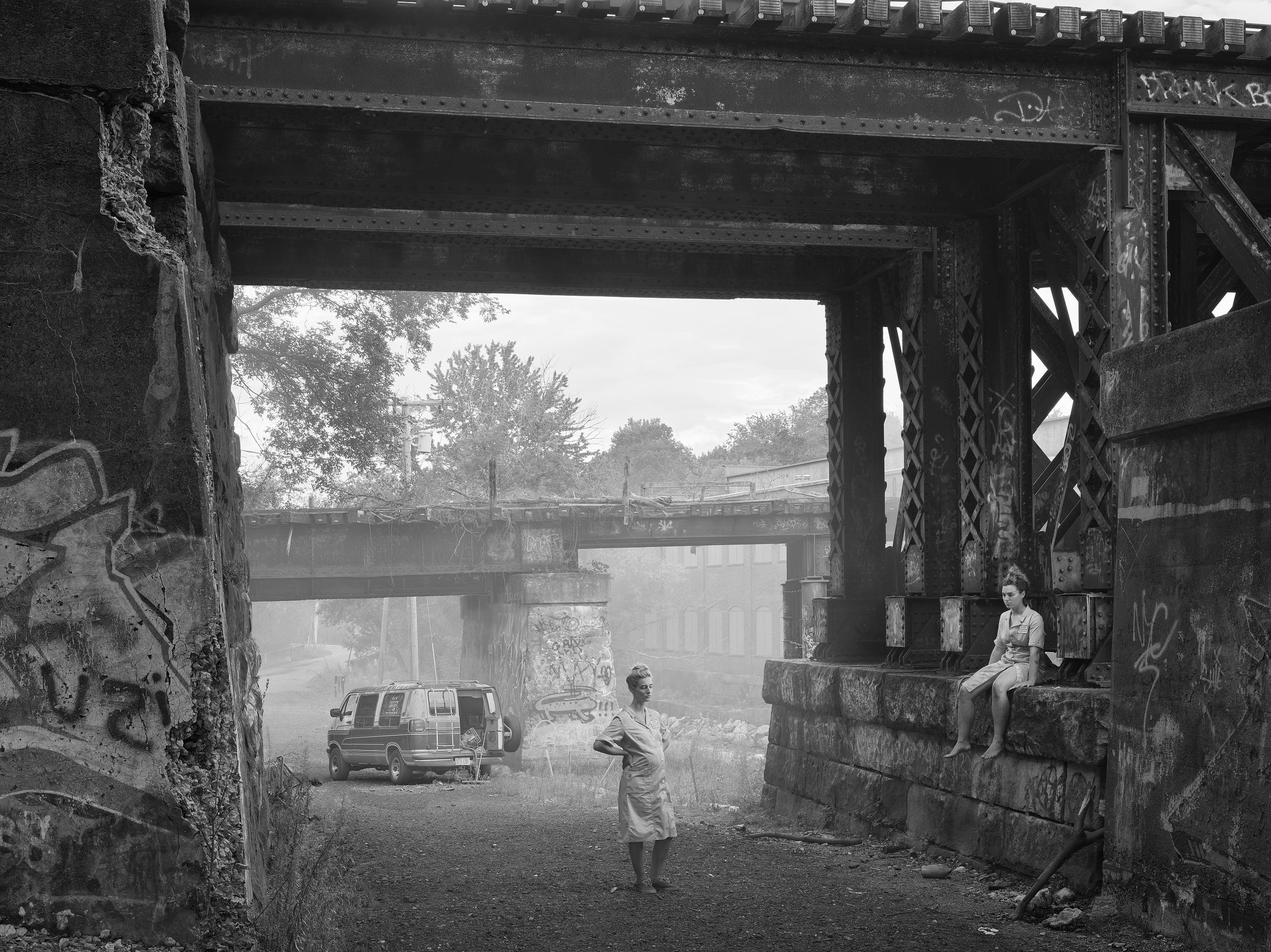
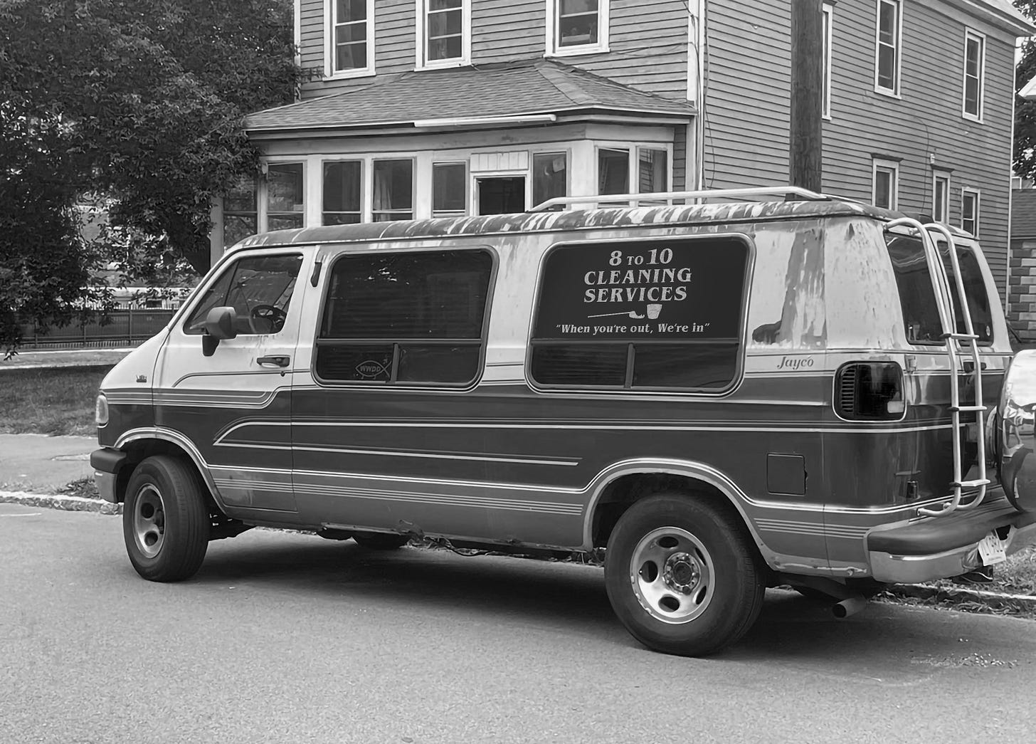
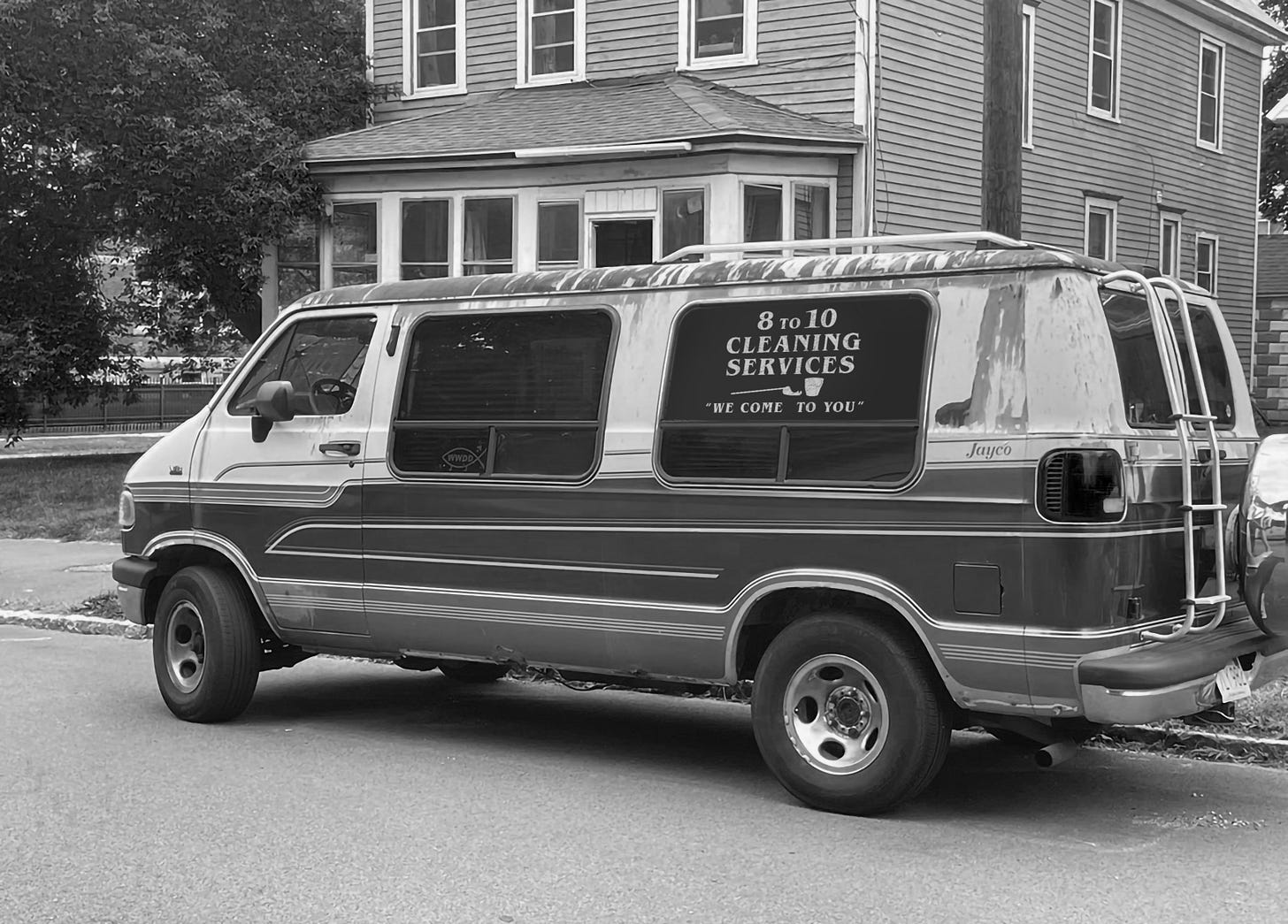
PERRY: I am often given photos of the locations and props—like vehicles—long before the photo composition is set up, and these “scouting” photos are the ones I send to Gregory for testing a design. So for this van for instance, which is amazingly junky in a 1980s kind of way, so not a commercial-type service van, had nowhere to put the sign Gregory wanted.. only the windows. Painted didn’t seem right. A phrase you hear a lot in scenic dressing is that something “wants to be something,” and in this case this sign wanted to be a decal. A cheap one. So, that’s what it became: an aging, sun-baked cracking vinyl decal.

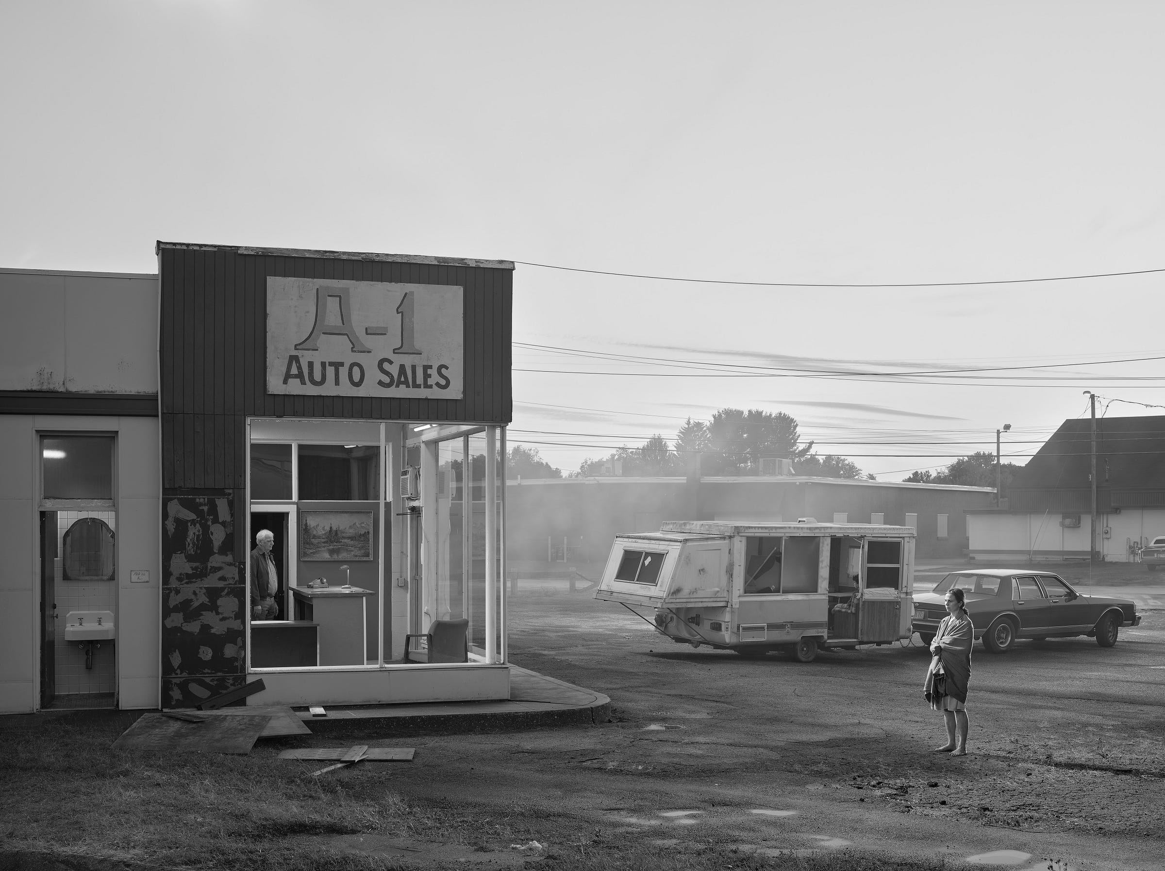
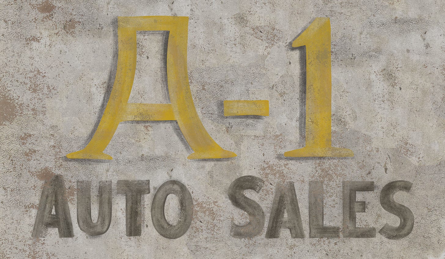
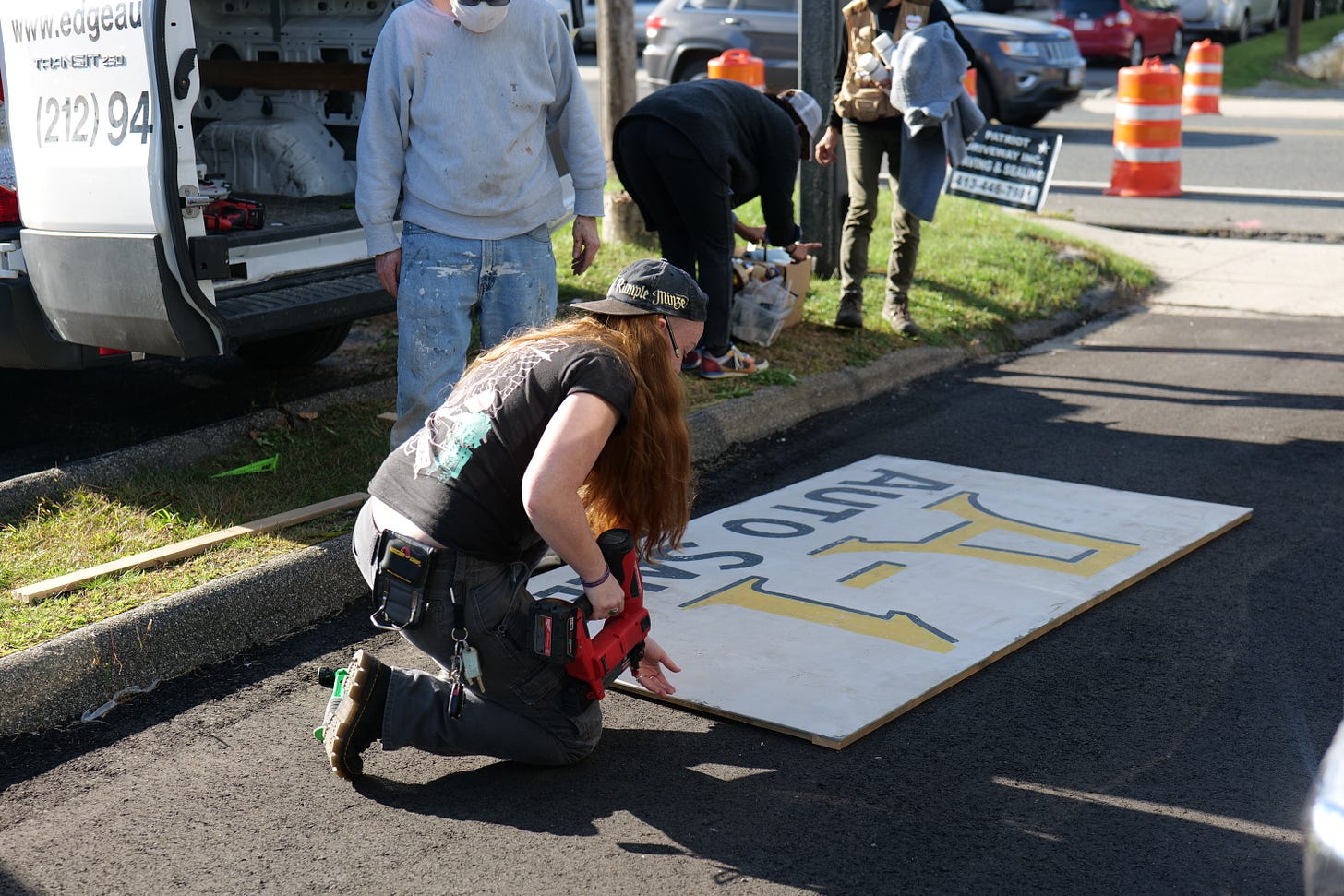
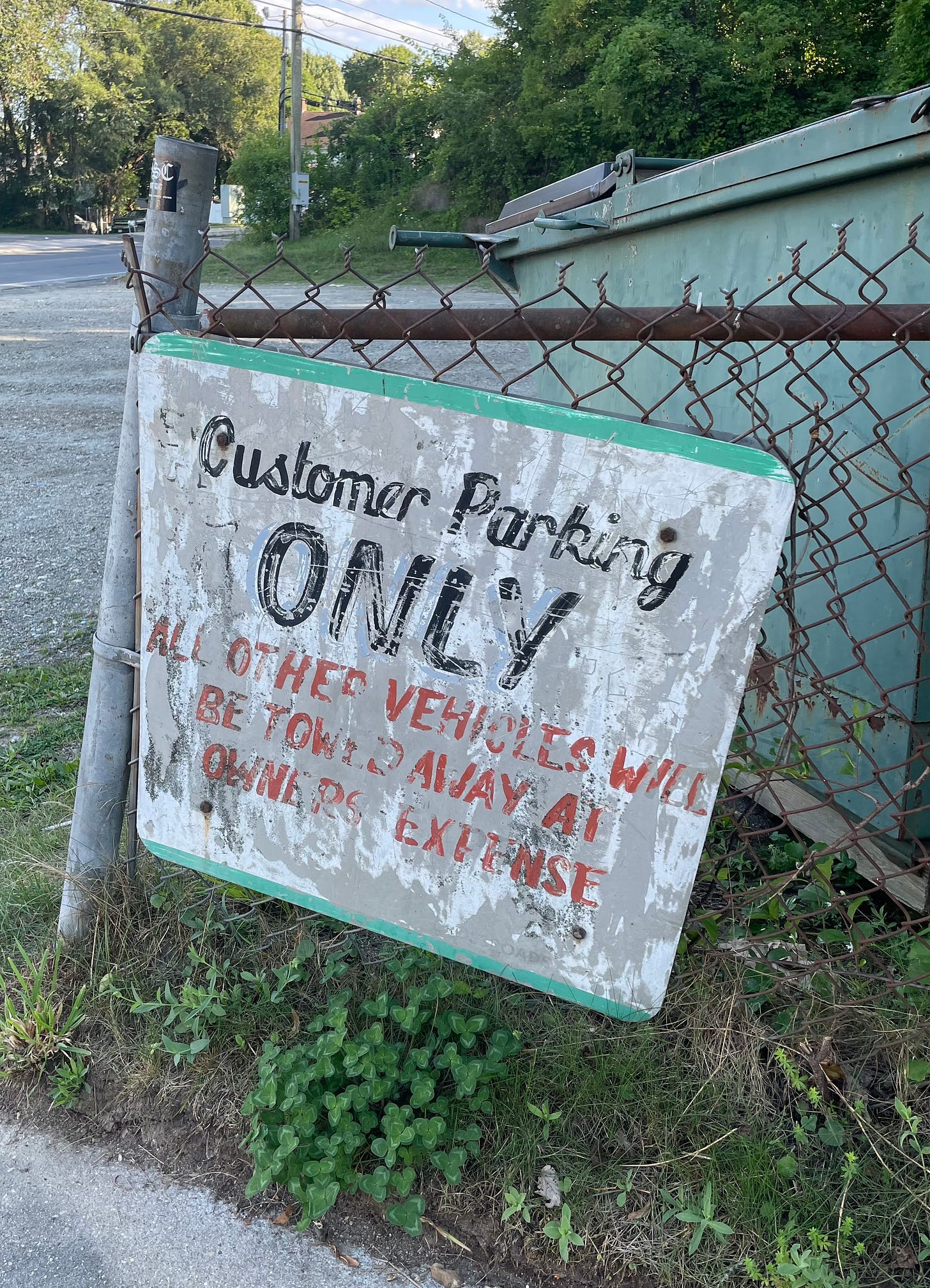
PERRY: I’m so flattered by this photo. The sign I made is so front and center, so large in the drama playing out. And in this way I’m glad the sign adds to the forlorn, kind of scraped-out relationship between the characters, and their landscape, such as it is. The weird kind of “A” on this sign wasn’t drawn from some source. I imagined someone long ago painting it, when the business was started, and they had some level of amateur ambition to be fancy or important, and this was their way of adding that.

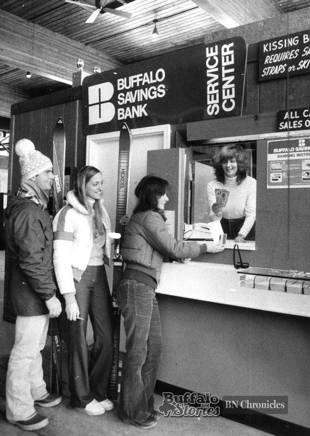
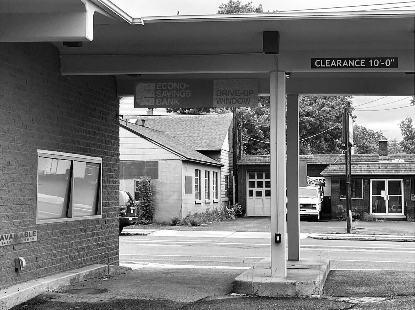
PERRY: This was so fun because the drive-through was already so clearly a relic of some busier, more successful time. As we often see in Crewdsonland, even the name that Gregory came up with, Econo-Savings bank evoked that. So the design I lifted from what I guess passed for happy banking in 1970s Buffalo, NY, along with the color that was once probably a vibrant light blue, and the Helvetica lettering were all deeply thought of as being born in a simple, solvent time. And then aged and damaged back to fulfill the ravages of busted dreams. I like too, that the sign saying Clearance 10’-0”, which was an existing part of the location, seems to offer an obscure comment on those unmet expectations.
PERRY: What’s nice about the “available” bank sign is that it does have a phone number, but I threw so much shit on it to make it look crappy, and also because of where it was placed, it obscured two of the numbers, which is a trick I usually do in movies because I hate the 555 nonsense; it just takes me right out of the picture, and most people do, too, but they overlook it and it just turns my stomach. So I tend to obscure letters. Some lawyers [in motion pictures] don’t let that fly.
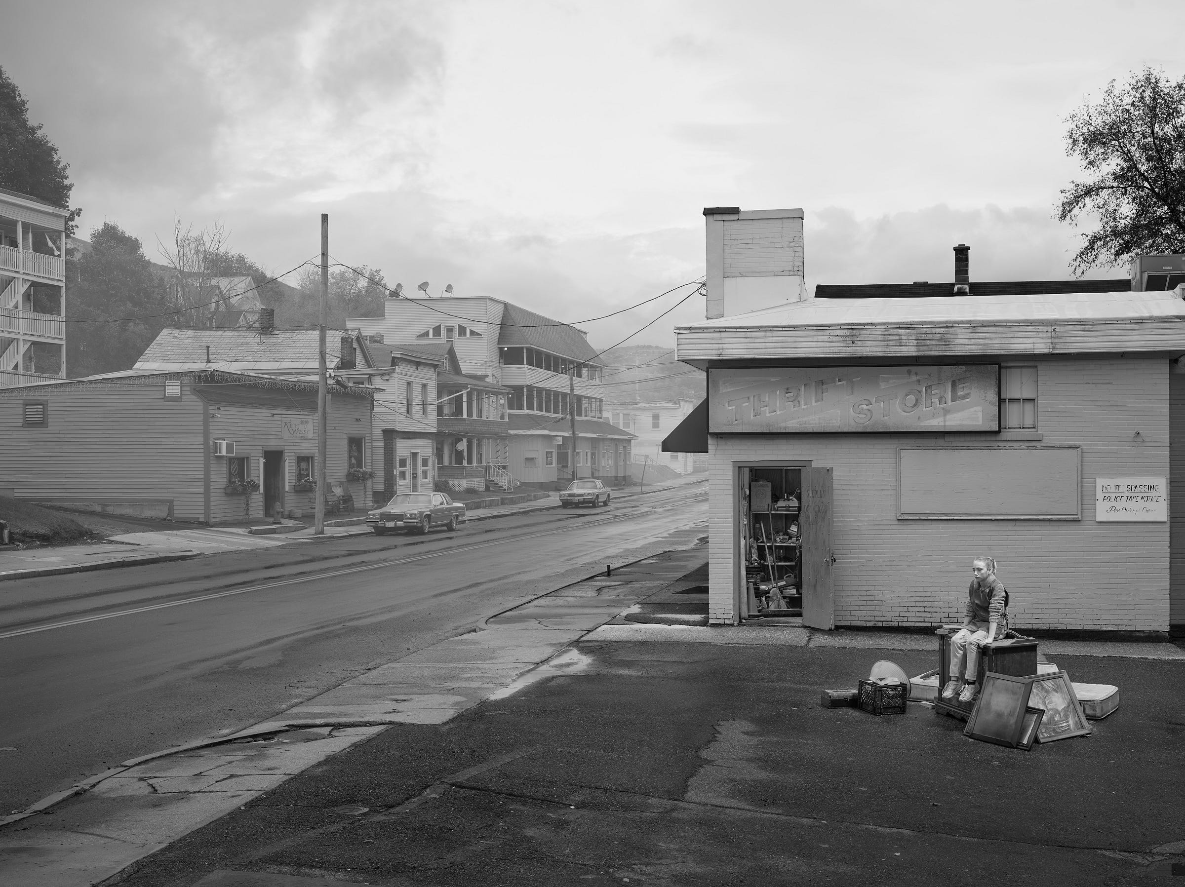
PERRY: This one was unusual because I was asked to create a sign for a photo that had already been composed. I think I put together three different designs, and I envisioned and detailed each of them to the point that eventually each seemed more real than the actual Goodwill sign of the location. Seemed that way to me, at least. But because the sign was so central, Gregory wanted it to be “aged back” to the point that it could barely be read. And oddly, that level of nuance is actually very time-consuming. White and black, as I imagine the colors of the lettering to be, age differently. Maybe because of the quality of the paint, or the effects of sunlight, or who knows.. the skill of the painter. As I kept “painting out” the letters to give them less prominence—and more age—I was doing it digitally with my Wacom pen, but in actual brushstrokes. That kind of thing takes a lot of quiet effort which is incredibly boring to talk about, but I think it pays off in terms of verisimilitude. And then maybe only to sign-lettering geeks like me. Verisimilitude, of course, being a five-dollar word for ‘looks like it belongs.’

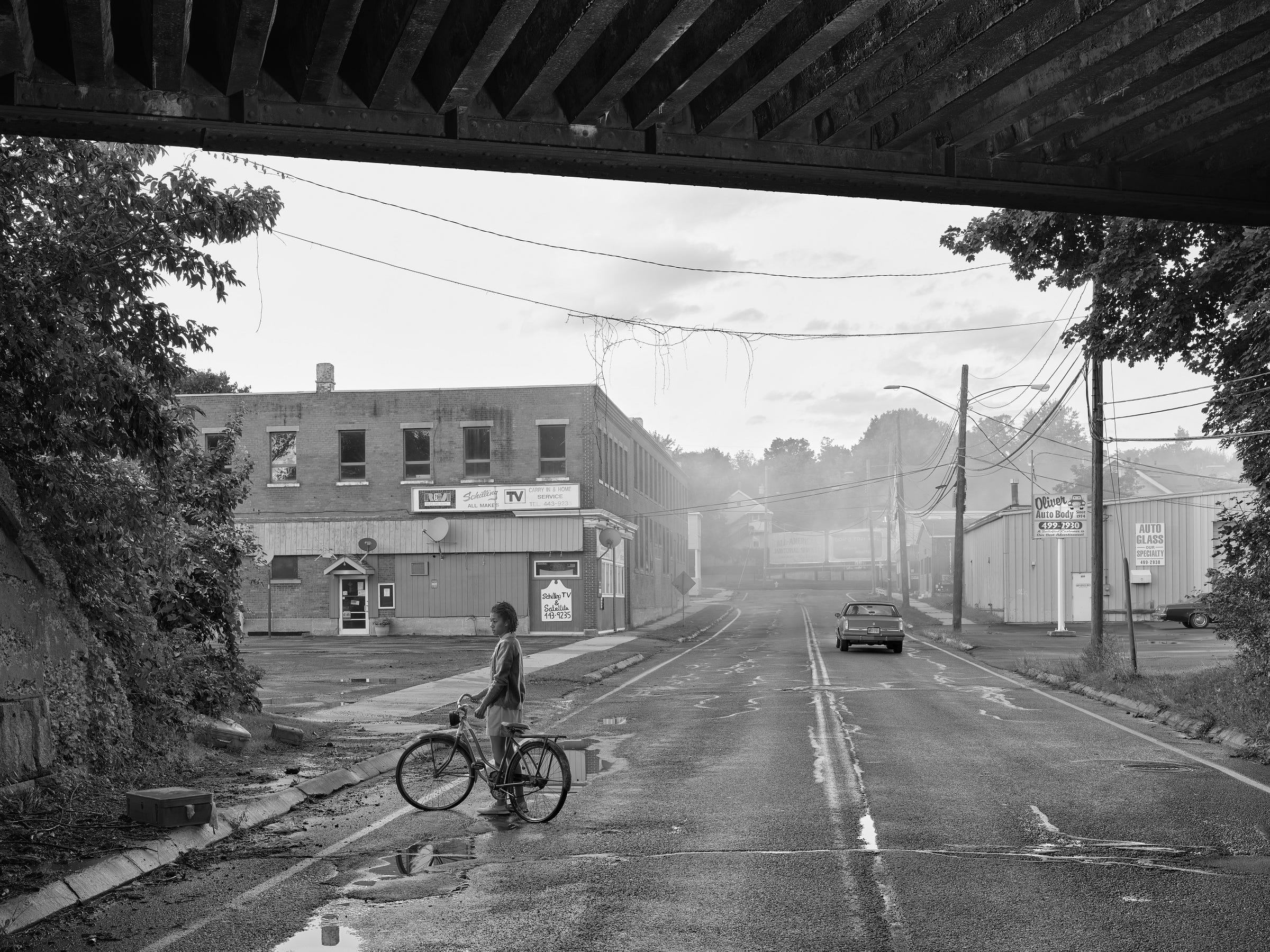



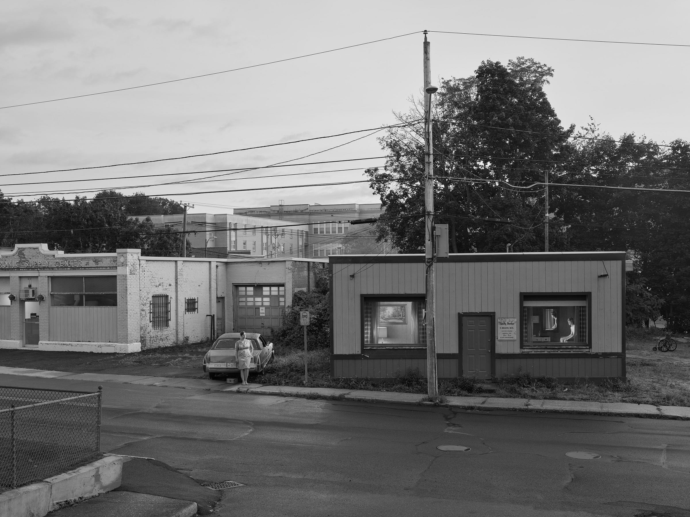
PERRY: Sometimes Gregory describes a scene to me, and the look of the signs he needs come to me in a flash, and the first thing I make is what he wants. This was not the case for the doctor sign. I made a bunch of different and more formal signs that all missed the mark, until he found this parking lot beauty and sent me a photo of it. After that it all came together quickly. And Mark Bachman painted it so well, with even more handmade-ness than I’d imagined for it. Really helps tell the story of this shady, ill-kempt doctor’s clinic. Though, to be fair, the decal on the left window that says “Walk-Ins Welcome” was a natural; super easy. I can’t remember if it was Gregory or me, or Juliane who came up with the idea for that sign, but the lettering choice was never in doubt: Brush Script vinyl lettering.. straight out of the can, as they say.
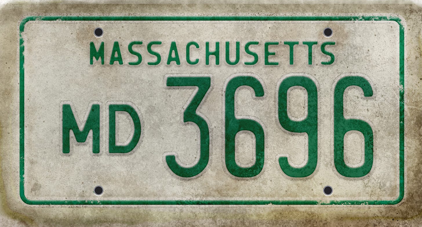
JULIANE: In the very early days of your pictures, Gregory, you just left the license plates on the cars. And then all through Beneath the Roses, or at least in mid-to-later productions on that series, I remember we would just take them off, and none of the cars had license plates. In Cathedral of the Pines I don’t think we had many cars, so we didn’t even worry about it, but maybe we took them off there as well. But with An Eclipse of Moths, we started using Perry’s license plates, which are made to look like old-school Massachusetts plates.
PERRY: They had green letters, as opposed to the newer red ones. And I should mention the medical plate I created for this picture was my dad’s old license plate, except his was from New York.
GREGORY: Your dad was a doctor?
PERRY: Yes. A pediatrician.
JULIANE: The MD plate adds a lot to this picture.
PERRY: I think you had specifically asked for the MD plate for this picture, Gregory?
GREGORY: Yes.
PERRY: Research does go into these things, so you can actually say that this is how Massachusetts does its MD plates, or that’s how they did do the plates in the ‘80s.
JULIANE: It’s not supposed to be formally period anyway.
GREGORY: It’s outside of time.
PERRY: Like a dream where you don’t remember every detail accurately.


PERRY: This sign over here that I brought; my wife found this at an antique store. And I just liked the lettering, which is so nice. I took a photograph, and isolated the letters out, and you may recognize this, [points to the word “room.”] which I lifted in its entirety, even the angle, and I incorporated that into the “Morningside Home for Women.” The “r” in “for,” here it is.
GREGORY: [whispers.] Ahh. Yeah.
PERRY: So you can see that “r” ends up right there.
GREGORY: Wow. Yeah.
PERRY [Points to “Morningside.”] This script comes from somewhere else.
GREGORY: Where did it come from?
PERRY: An old circus poster, that I can’t find the original of. But I have since used this script, I have remade it many many times. Some of the letters were not available so I had to make the letters from what was there. And, you know, when I make these things digitally — everything is made by hand anyway — but you’ll notice that the two dots are different [above the i’s] and if there are two letters that are the same in a word, I don’t use the same letter twice. I tend to make changes so that it looks fresh. Cause the “e” is so great. But once you start pulling out the vectors from Illustrator to Photoshop, some of the nuances are lost. So I still wind up painting things anyway. And this is interesting, too, and I don’t know how much you want to reveal about this. But this [the weathering and patina] come from a—
JULIANE: It was a cemetery, right?
PERRY: Yes. A picture I had taken somewhere in Connecticut. The West Plain Cemetery.
JULIANE: Why wouldn’t you want to reveal it?
PERRY: I don’t know. Cause Gregory has all this magic.
GREGORY: I thought you were gonna say it was like someone who collects mushrooms, they don’t want to reveal their “spots.” Their locations.
PERRY: That’s true too.
GREGORY: What period is that from, do you think?
PERRY: I want to say it was probably from the ‘40s. Just ‘cause it’s still holding up, but I don’t know, I’ve never seen rust or age like that on anything like that. But what’s nice is that the red, which absorbs alot more of the harsh sunny light, the infrared — the spectrum tends to make red fade faster than all the other colors. So when you do red, which is what I assume that was, it left probably some of the chemicals in the red, rusted the metal, but also faded away, and gave this beautiful patina, which I tried to incorporate into the — I erased the letters and painted back the aging that was there. And then I put it on the blank.
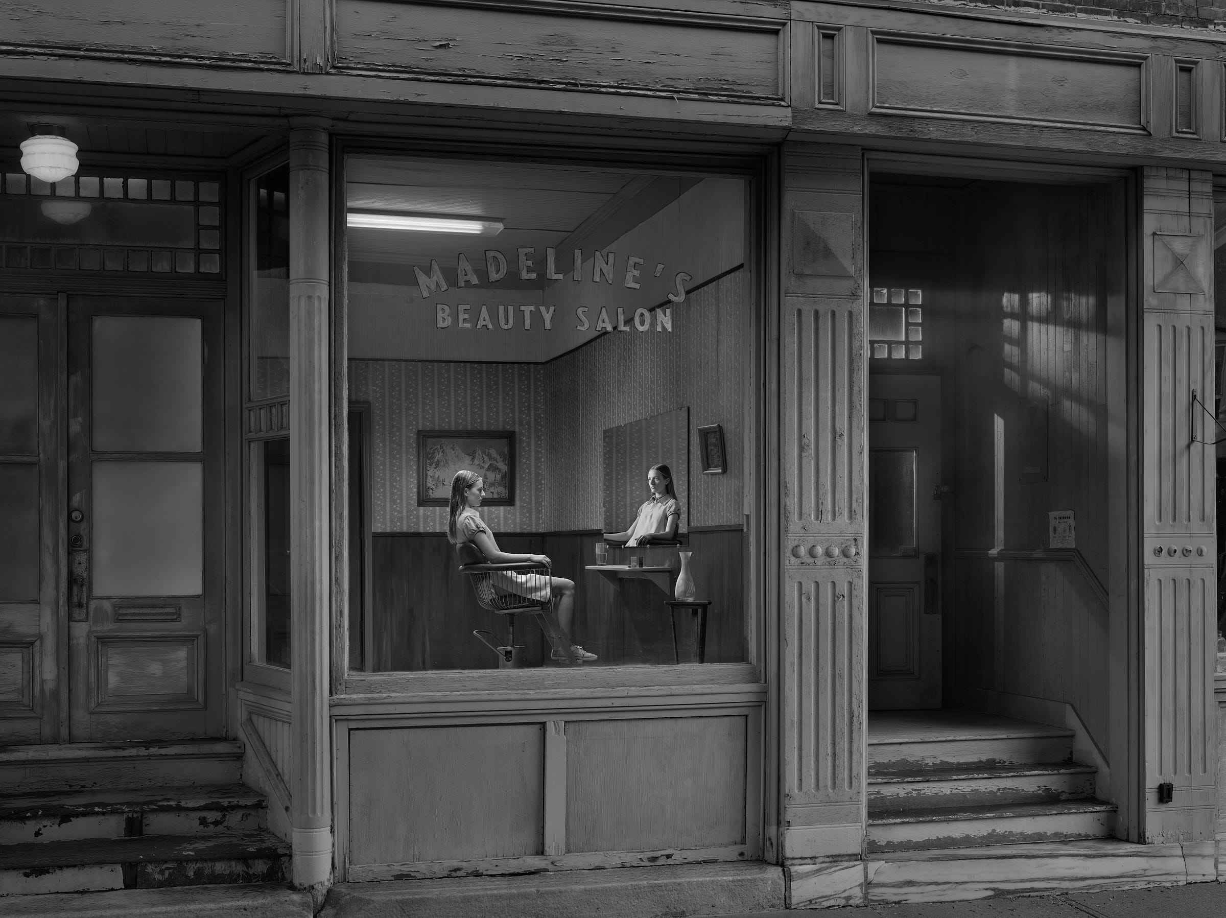
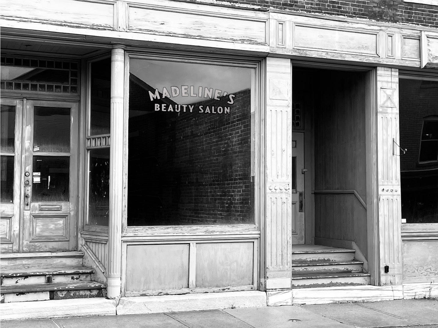
PERRY: I came up to North Adams to rubberneck while this location was being dressed, which was a lot of fun. Cold, and slow as it often is on location sets, but everyone on the crew was busy doing their jobs very well, and not many people knew who I was. Really, I just wanted to be among the rest of the crew for once, since 99% of the time I work alone in my studio, and also to see my design being applied in real life. Mark Bachman again did such a beautiful job on the lettering. I gave him metallic vinyl letterforms, which he painted up with somewhat rough-hewn thick black outlines and plenty of junk texture. It’s such a beautifully composed photo with so much architectural character and subtle lighting. My sign is so prosaic it almost disappears, but it’s right there, front and center. I feel so lucky to be given such prominent showcases for my own modest efforts to augment Gregory’s work. Often I feel like all I’m doing is adding a brush stroke here or there as he asks, but really I think his artistry and effort is elevating mine to the point of real accomplishment.
This piece was edited and assembled by Juliane Hiam, Gregory’s partner and creative producer.
Eveningside opens Nov. 8 at Daniel Templon Gallery in Paris. For more information visit their website.













wow. Sensational collection of images. thanks for sharing.
Love all the details in this post. As a photographer - turned graphic designed - who came back to photography more recently, I appreciate all the work done on the set to make these images happen.